Is Your Brand Making the Right First Impression?
In today's busy world we have just seconds to capture someone's attention with our business, and your brand visuals play therefore an even bigger role than perhaps before. The reality is that no one spends time researching a product or service from a brand that is not visually appealing to them.
Your visual presence is a powerful tool to get your brand to stand out, noticed, and stay in the minds of your customers. In fact, the human brain is said to process symbols and visuals 60,000 times faster than it understands and registers the meaning of words.
Words are also processed by our short-term memory where we can only retain a small amount of information at any given time. Images, on the other hand, go directly into long-term memory and the effect only increases over time as pictures and images are more likely to be remembered than words.
But of course, no matter how beautiful your visuals are, it doesn't matter if the impression they give out is the wrong one.
There are few very common reasons why the first impression of your branding might fail to deliver, and in this blog post, I'm going to cover with you the three biggest ones and what you can do about it.
1. You're missing brand clarity
The most common problem I hear business owners struggle with when it comes to their branding is that they like so many different styles and can't decide what their branding should look like.
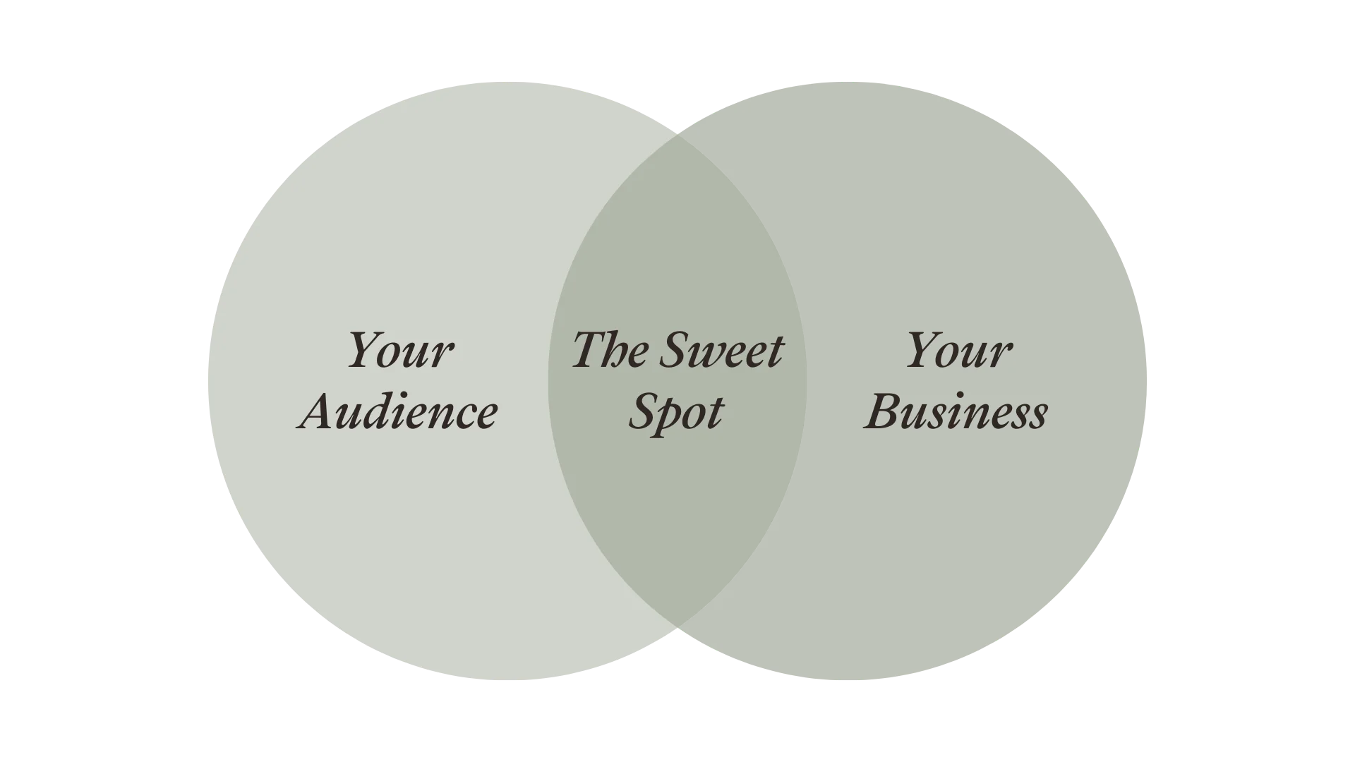
The first major problem in this is the focus on what you like, as your branding first and foremost should speak to your audience, not only represent your personal taste.
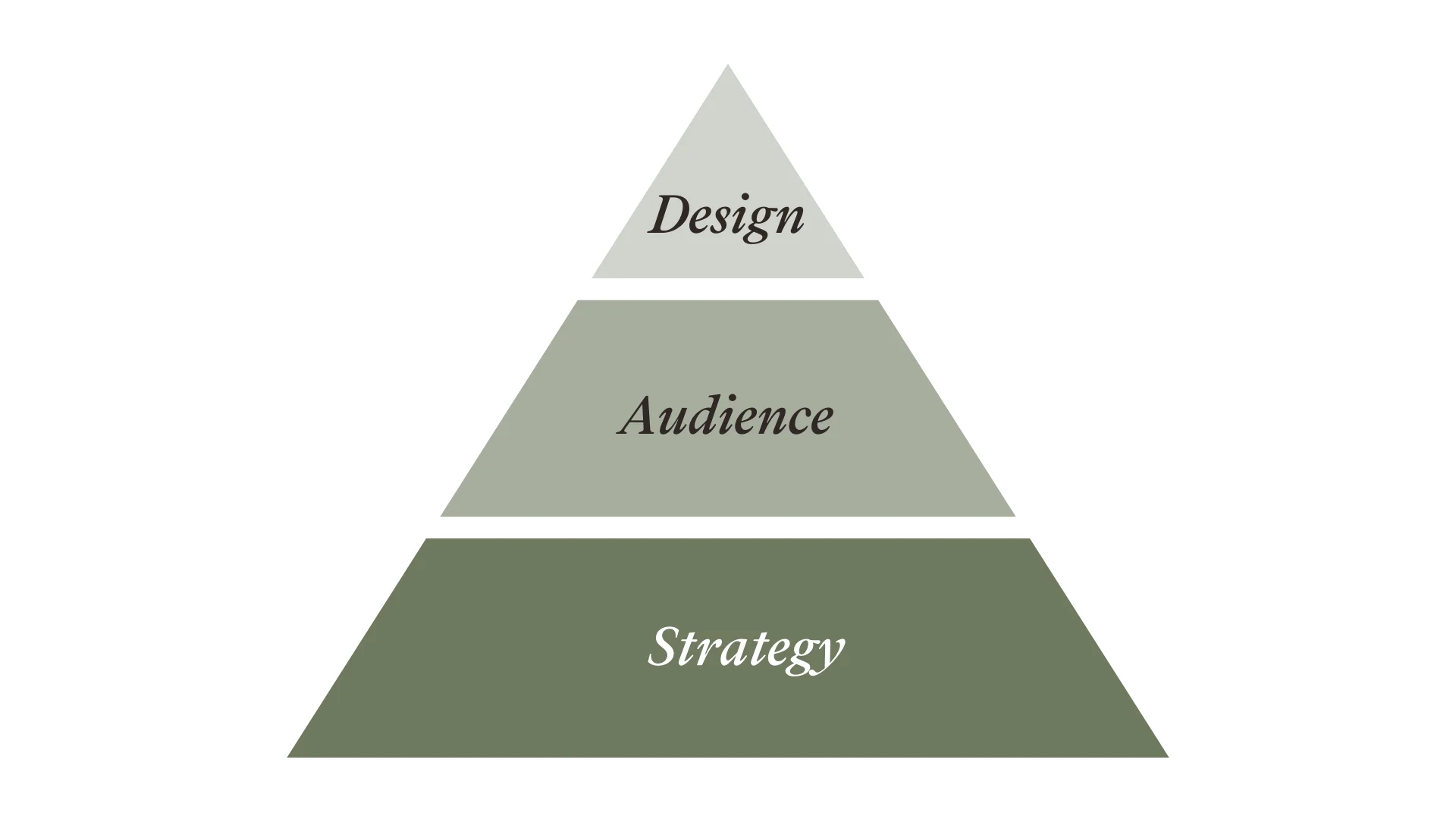
But the actual core of this problem is usually the lack of brand clarity; a full understanding of who you are as a brand, who you're trying to serve through it, and why.
If you're not first clear about your brand's personality and voice, why you do what you do (beyond financial gain) and what promises you as a brand commit to, and how you plan to keep them, it's no surprise if you struggle to find a style that would speak for all that.
You also might know the age range and sex of your target audience, but if you don't understand how they want to feel, what kind of language they align with, what are their values and what are they afraid of, your visuals might give out the wrong message or end up being too vague for anyone to resonate with.
Without brand clarity you can't expect to create a strong brand or brand identity (the visuals) as even the most beautiful design will not fix the fact that there's no connection to your brand that pulls it all together.
To fix this you have to be willing to take a deep dive into your brand and really understand what is it that you're trying to say and make people feel with it and who you want it to speak to as your branding should always work as a connection between YOU and your ideal clients.
2. Your branding is not tailored to you
This takes us to the second reason that often causes a bad or wrong kind of first impression and it is the focus on a beautiful look that doesn't necessarily have much connection to your brand.
It's very easy and quite cheap too to buy beautiful designs these days. Just pop into Creative Market and choose a nice looking brand kit or a beautiful logo, and with a click of a button, it's yours. I get the temptation, and I am certainly not judging anyone doing so as there is a time and place for everything but here's the problem with it.
As beautifully designed as these templates may be, it doesn't mean that they work for YOUR brand.
The person designing these templates has hopefully the best intentions to help you, but a generic template doesn't reflect what is unique about you or take into account your ideal customer and what they respond to.
One of the main points of your branding is also to be unique to you so using a template that potentially tens, hundreds, or even thousands of other businesses are using is doing you a huge disservice in the long run. If you choose to go this route in the beginning, at least customise the templates heavily to make them as unique as possible to you.
If you're ready and willing to strategically build your branding instead, I recommend you to start by focusing on the emotions you want your visual to reflect and consider also the psychological associations of your colours, fonts, images, and even the shapes that you use in your visuals and take a closer look at your competition and how you can be different.
3. Undelivered promise or perception
Branding is about influencing your audience's perception of your brand, but what if the first impression and perception conflicts with the experience you're trying to promote?
Last but not least the reason why your first impression doesn't work is usually one of the following; either an undelivered promise where your visuals present an idea that your brand can't live up to or an undelivered perception where what you offer is great but your visuals are not reflecting the quality, professionalism and experience your audience would get.
Either way, you have a problem as you either end up causing confusion, disappointment, and lack of trust in your brand or not getting the attention you deserve in the first place. More often it's the latter.
To increase the perception of quality, professionalism and good experience make sure you're consistent with your visuals everywhere you present your business. Pay attention also to the alignment of elements, quality of images, use of negative space, user-friendliness of your website, readability of your fonts, and the overall experience for your customers from start to finish. But most importantly make sure to choose visuals that reflect the emotions you want to associate your brand with in the first place.
This doesn't mean that you can't succeed before you nail all this perfectly, but giving it your focus and building your brand with a clear strategy in mind you'll most definitely speed up your growth, get the attention of the right audience faster, and through that increase your sales too as trust in a brand has a direct connection to positive purchase decisions.
If there's however one thing I would like you to remember it is that your brand isn't something you get to decide. It's what your audience thinks and how they feel about it so always keep them as your first priority.
With kindness,
![]()

Explore my free resources:
→ FREE 30-day Kajabi trial
→ FREE Website Checklist
→ FREE Sales Page Guide
Or find out more about my:
→ Kajabi Template Shop
→ Brand & Web Design services

